THE PROJECT

eCycle is an e-bike-sharing system that provides electric bikes for people to use within various city locations situated across Canada. eCycle consists of multiple interconnected stations whereby people can exchange e-bikes to rent. The ‘docking’ stations provide convenient drop off and pick up locations to those with few mobility alternatives. This case was part of a design course.

Project duration: 10 days.

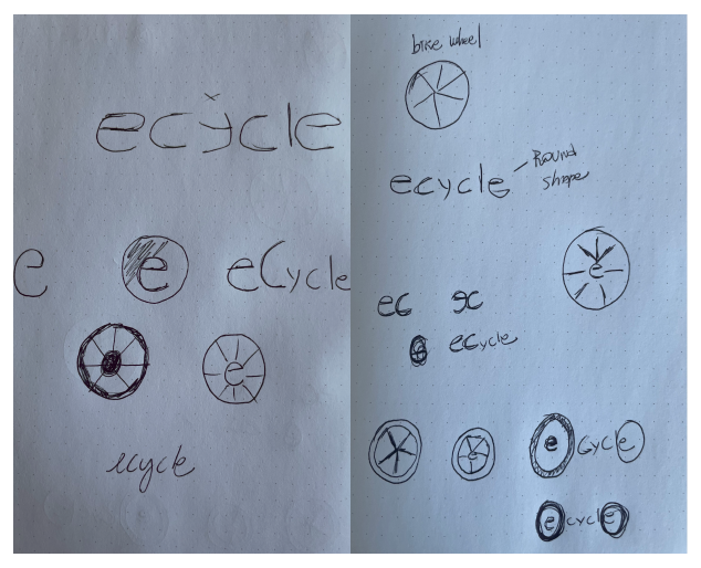
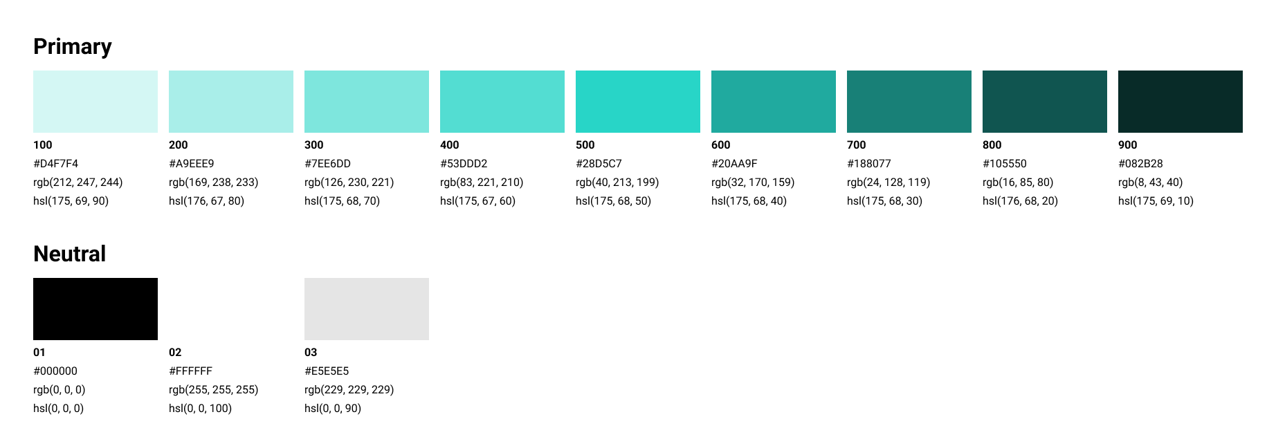
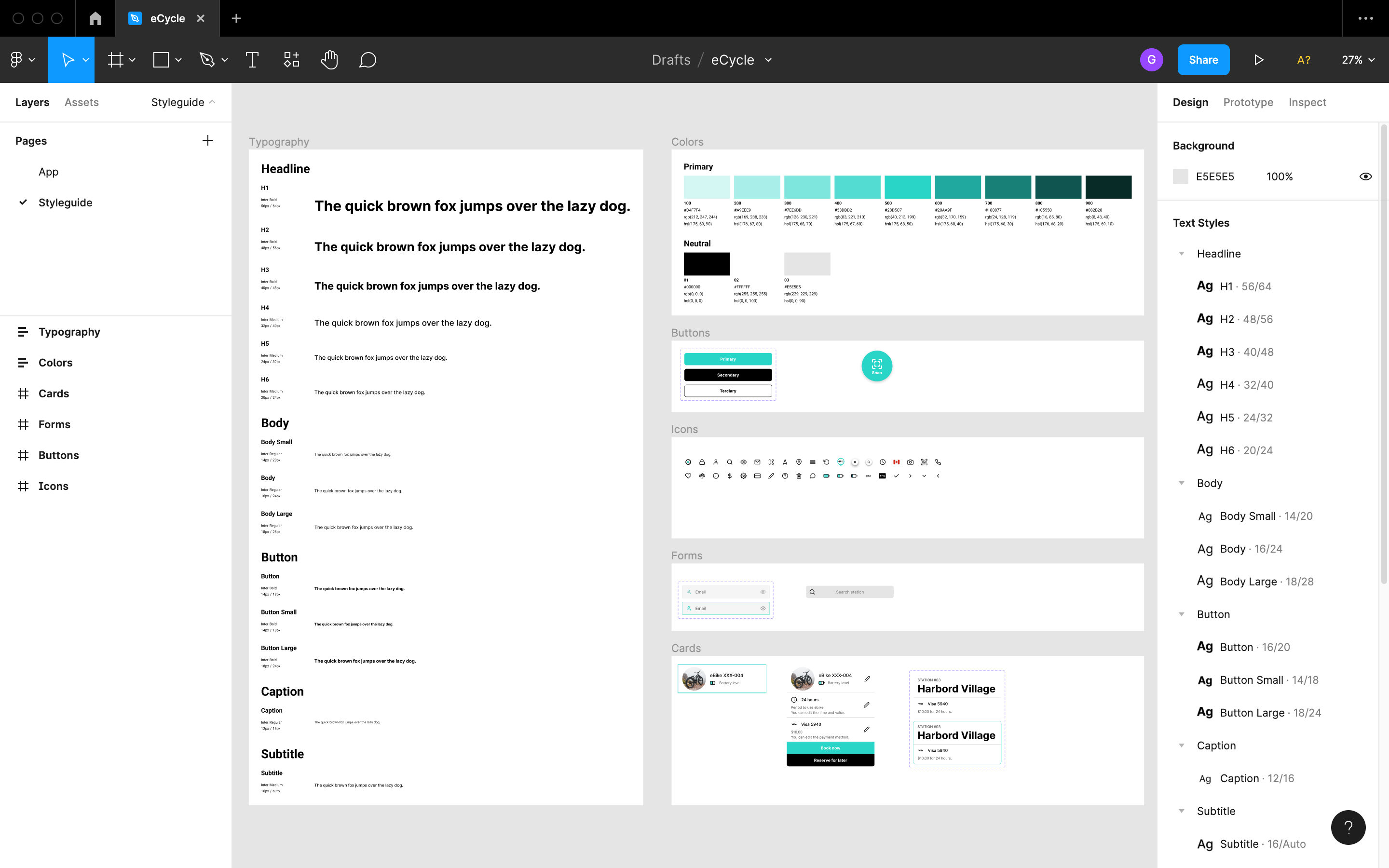
My role: Solo project, being responsible for all techniques, sketches, brand guide, logo creation and final design.

The problem: eCycle users have only been able to locate available bikes and rent from the station kiosk without previous information, frustrating those who find no bikes available.

Objective: Elaborate a platform capable of providing information and options for users to their rides prior getting to the docking station.

the approach

dESK RESEARCH & competitive analysis

3 Competitors

Storyboard

5 stages

User Flow

Happy path

Wireframes

App sketches

dESIGN

Logo
Styleguide
25 screens

High Fidelity Prototype

Minimum Viable Product

Analysing business field and competitors

Desk research and competitive analysis were performed to better understand the field, the competitors’ business, their service as well as the overall design of their apps.

Key points raised for attention and possible opportunities:

  • Excessive personal information requested to sign up
  • Poor customer service and help sections in case of assistance
  • No shortcuts for everyday destinations
  • Difficulty in making payments on the app
  • No ride history
  • No booking options for a specific time
  • Hard visualization of electric bikes’ battery power

iNCREASING CERTAINTY, DECREASING ANXIETY

A storyboard to illustrate situations where the user could plan their rides using a functionality that will serve to guarantee the bike will be there for them prior their arrival to the docking station. Working on reliability and precision to/while decreasing anxiety and uncertainty.

USERFLOW

It has been focused on the main functionalities on the app as mentioned in the brief, such as how to rent the eBike and finding key information throughout the user navigation.

DESIGN

Logo Sketch

Searching for a round shape, the circle around the “e” (for eCycle) is an allusion for the bike wheel.

Logo & App icon

eCycle is a greener alternative to cars and other vehicles.
It is used neutral colours (black and white) to keep the logo and interface elegant. The colours can vary depending on the contrast with the background for both fonts and the logo.

Typography

Inter is the official eCycle typeface. It is a clear font to understand, always looking for accessibility, so users can better see, read, and get informed on the app with no major problems. 

Colour Pallete

All the colours and its variations with neutral colours used on the application.

Styleguide

Components and styles including icons, typography, colours, buttons, forms and cards organised in Figma with best practices in mind.

High FIdelity

The MVP with essential features and market opportunities addressed in the research.

pROTOTYPE

The happy path showing screens step-by-step from signing in to returning the electric bike at a docking station.

  • The user can either scan ebike QR code without previous booking or opt between book for 1 hour and reserve for 24hrs.
  • Upon retuning bike at a station, the user is billed after the bike is returned to the station based on the time window used.
  • Ride history also serves as shortcut to avoid selecting the same options repeatedly.
  • Payments are easily made by billing the user upon returning ebike to a docking station based on the time selected and/or used.
  • Payments are easily made by billing the user upon returning ebike to a docking station.
  • Options to sign up by email and entering information.
  • Options to access the app as guest and sign up by email and entering information.

pROTOTYPE

Main features eCycle app presents for the user:

  • Unlock ebike by scanning its QR code at a station without previous booking 
  • Choose between book for 1 hour or reserve for 24hrs.
  • Ride history as a shortcut to avoid selecting the same options repeatedly.
  • Payments are easily made by billing the user upon returning ebike to a station based on the time selected and/or used.
  • Menu has clear information and option to contact eCycle’s customer service
  • Different options to sign up.

Next steps

Usability test to address possible improvements, issues, and make any necessary changes. All insights will serve to elaborate future roadmaps in order to improve the app.

LEARNINGS

Due to the time given, I’ve had to adapt the processabdicating some techniques to fit the deadline.

Not always we face conditions we want to perform our work. And that is why we have to find ways to work with constraints and limitations, choosing the appropriate approach to come up with the best deliverables possible.

A big thank you to the Unsplash community for the amazing pictures.

LEARNINGS

Due to the time given, I’ve had to adapt the processabdicating some techniques to fit the deadline.

Not always we face conditions we want to perform our work. And that is why we have to find ways to work with constraints and limitations, choosing the appropriate approach to come up with/deliver the best deliverables possible.

A big thank you to the Unsplash community for the amazing pictures.